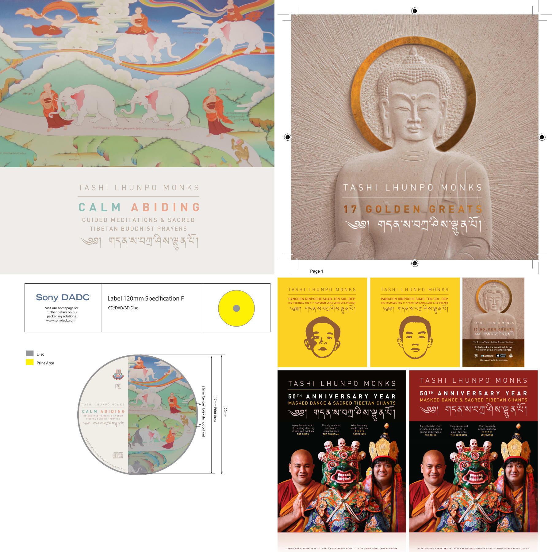
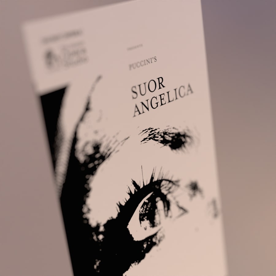
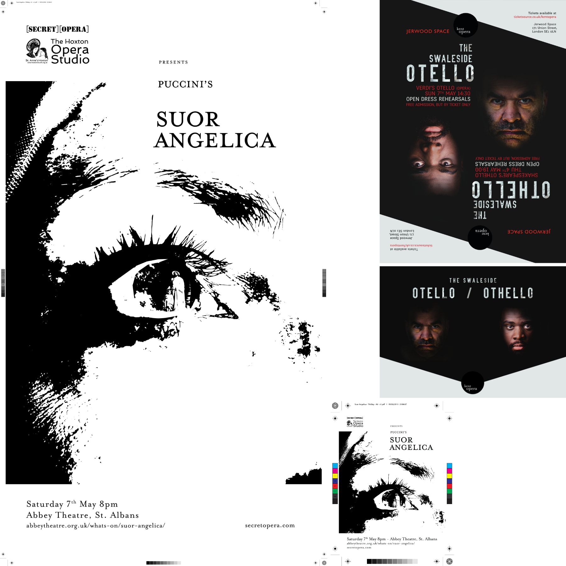
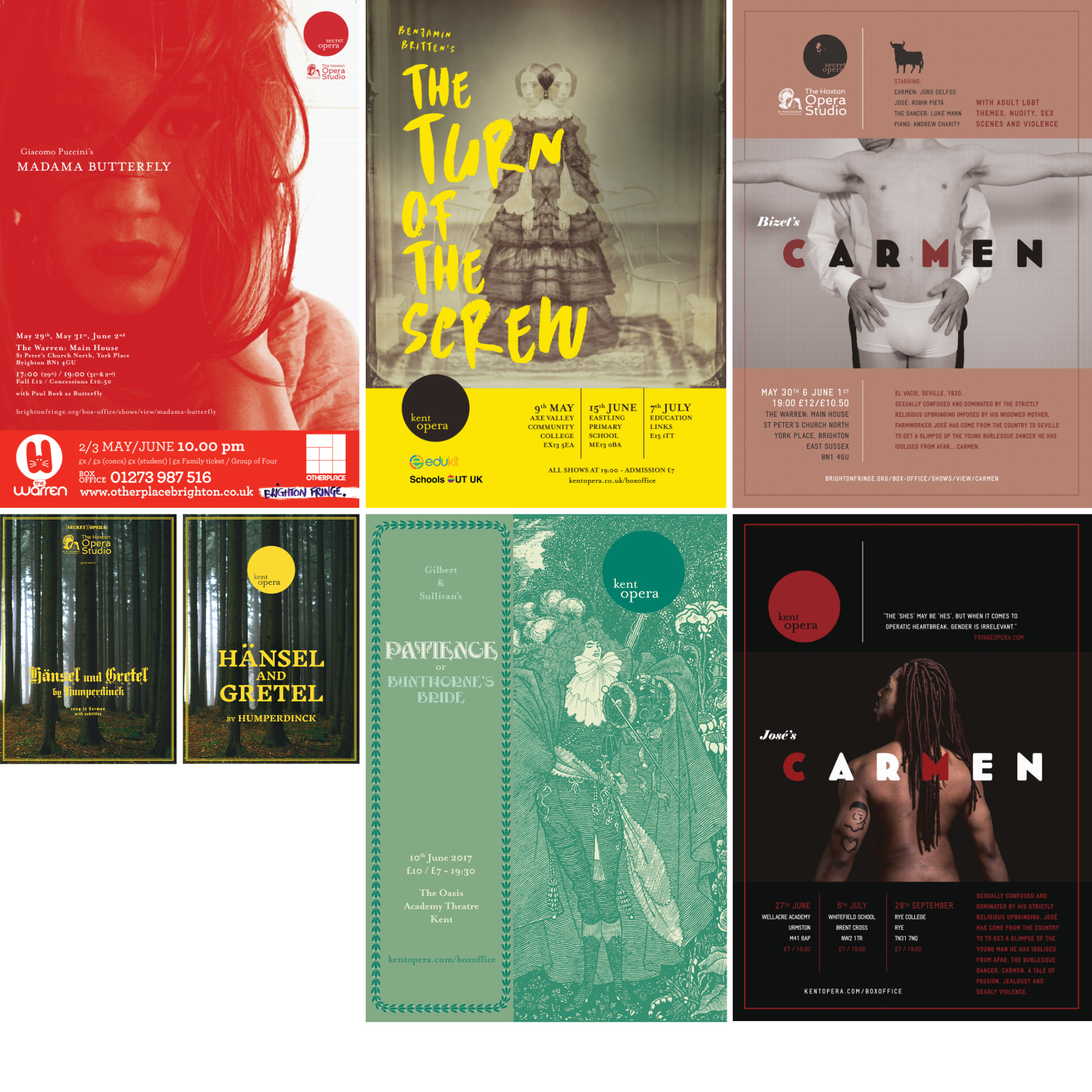
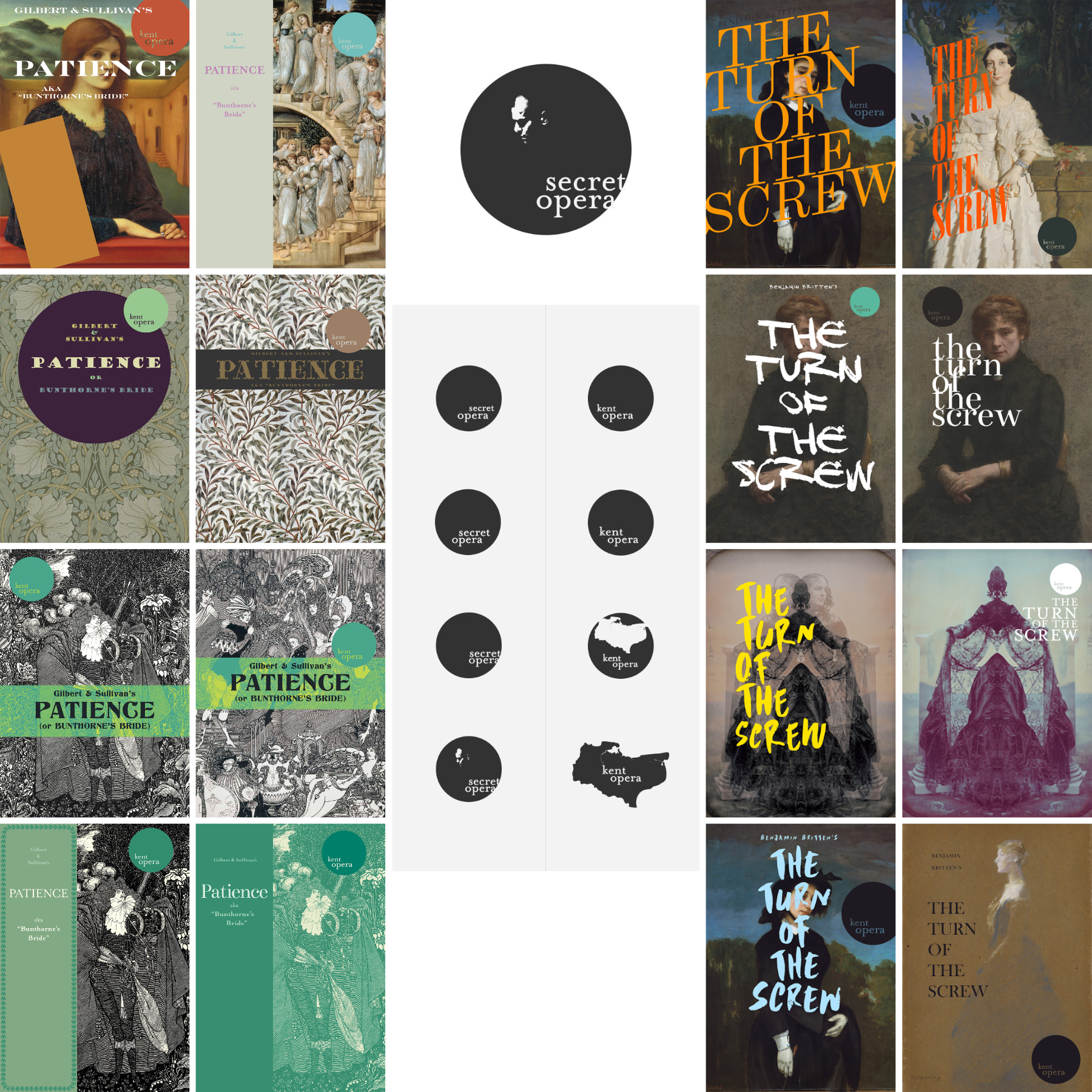
Synopsis

Simon has always been a joy to work with - and were it not for UK customs sitting on his brand new guitar, you'd be seeing a brand new website, not one primarily from 2017.

simonrussellmusic.com

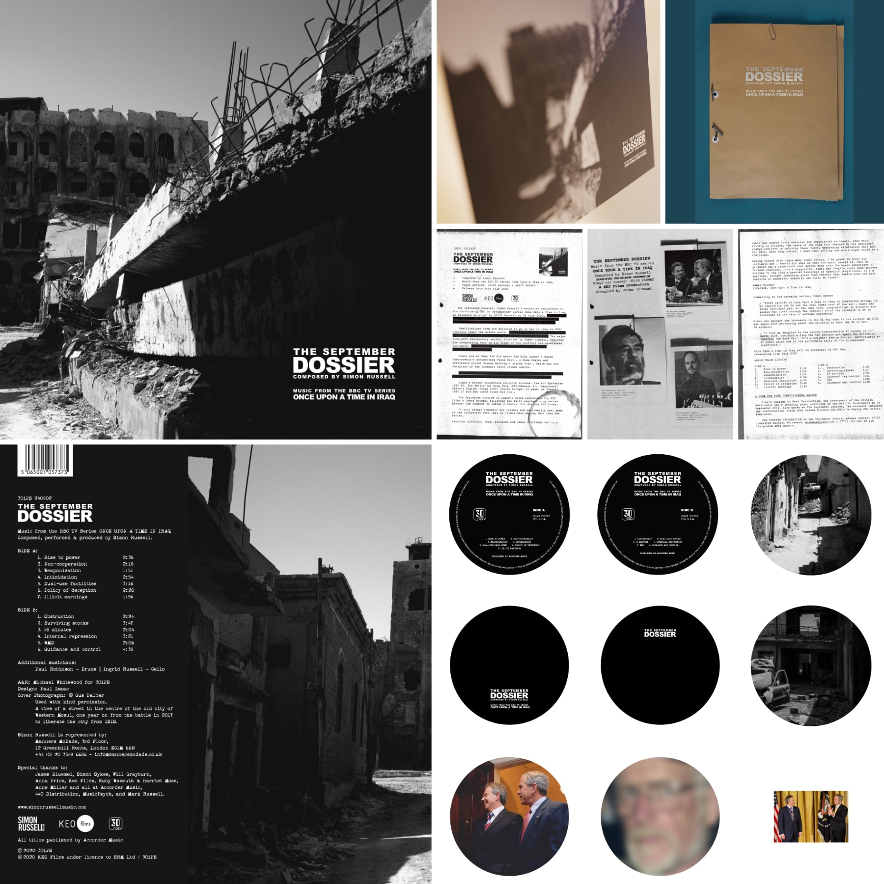
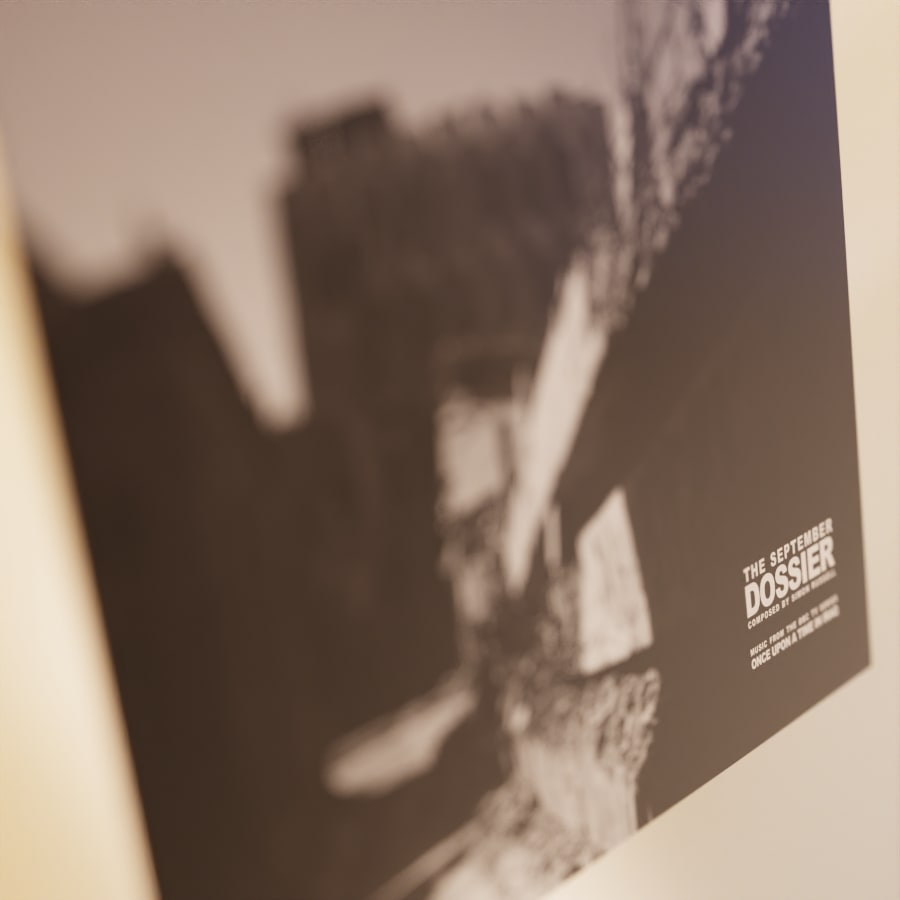
“The September Dossier” - Soundtrack to the BBC’ award-winning documentary ‘Once Upon a Time in Iraq’.

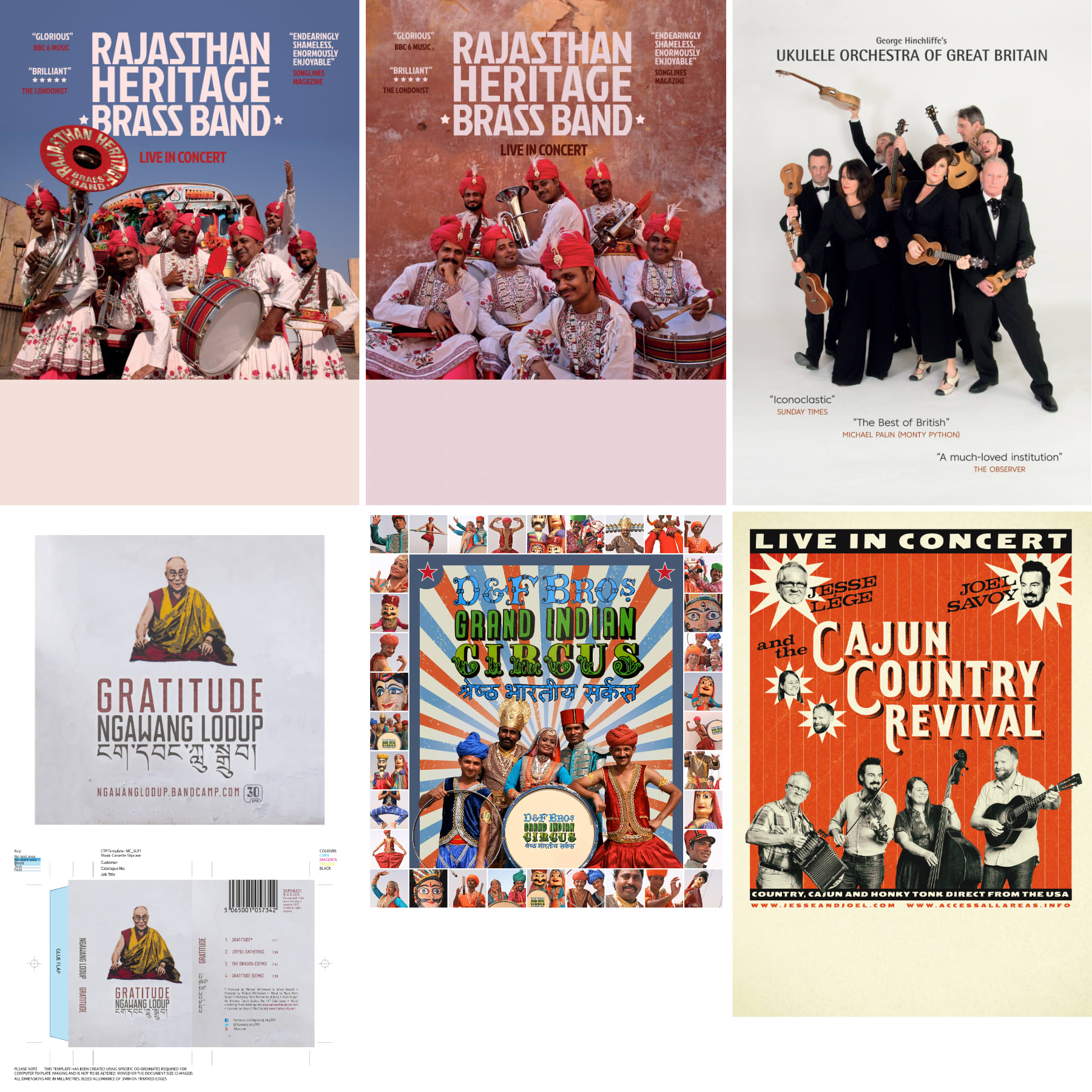
Design & Print for Vinyl LP

A cursed project from start to finish. An LP intended to be released on Record Store Day - legal wrangles over digital rights, fires at vinyl pressing factories, destruction of pressing plates, Brexit destroying all odds of vinyl manufacture in Europe... And then COVID-19 arrived.

Shown are pages from a promo document based upon declassified pages of the “Dodgy Dossier”

Some of the ‘spicier’ designs for the vinyl hub were avoided for political reasons. The documentary film-makers had alledgedly been under constant harrassment when making the documentary.

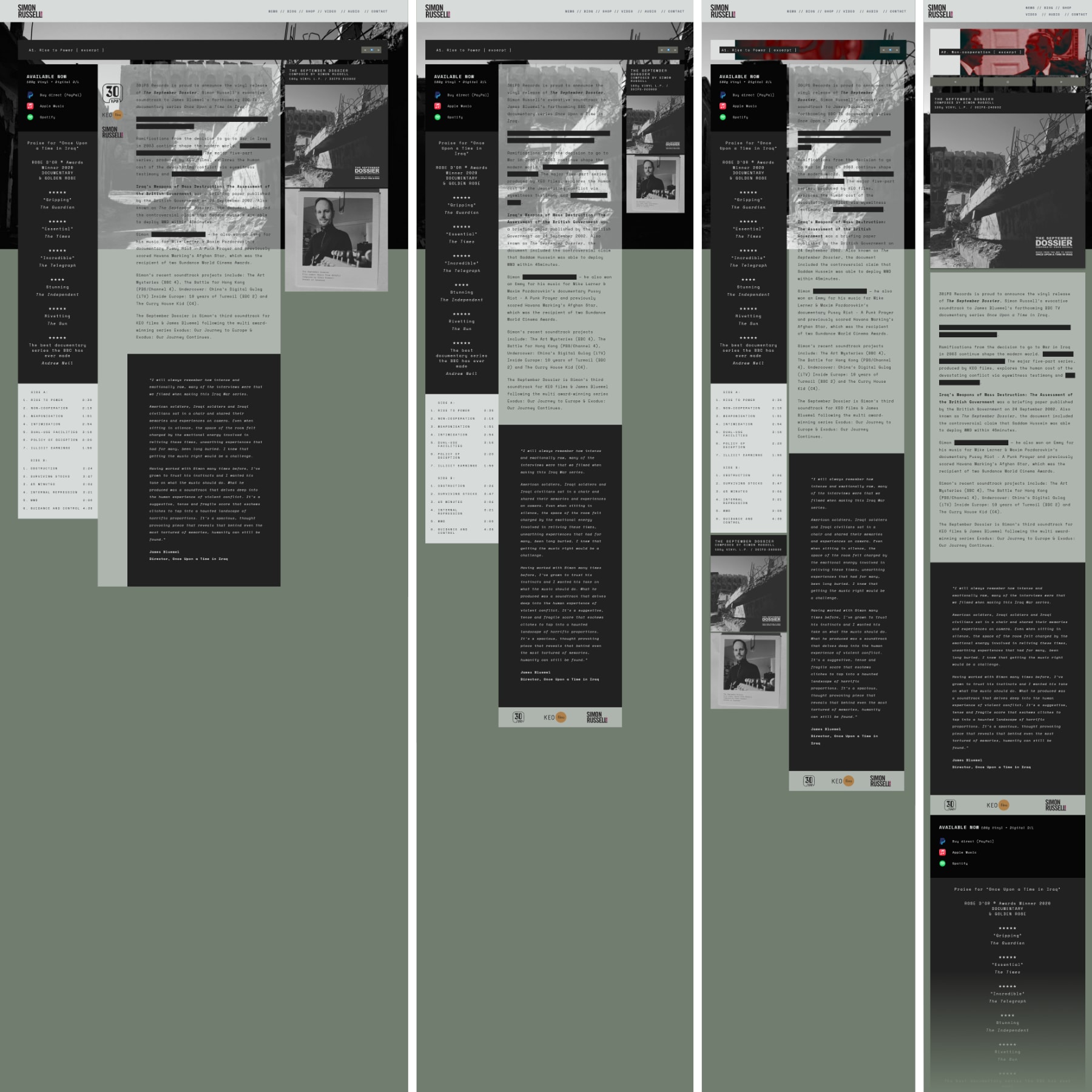
Once Upon a Time in Iraq - Homepage Takeover

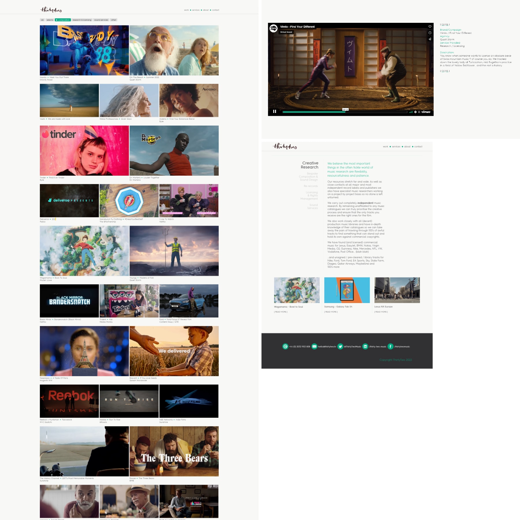
Designed in-browser, screenshots show the columns-to-linear responsive homepage makeover to promote The September Dossier release.

The audio player auditions snippets of each LP track.

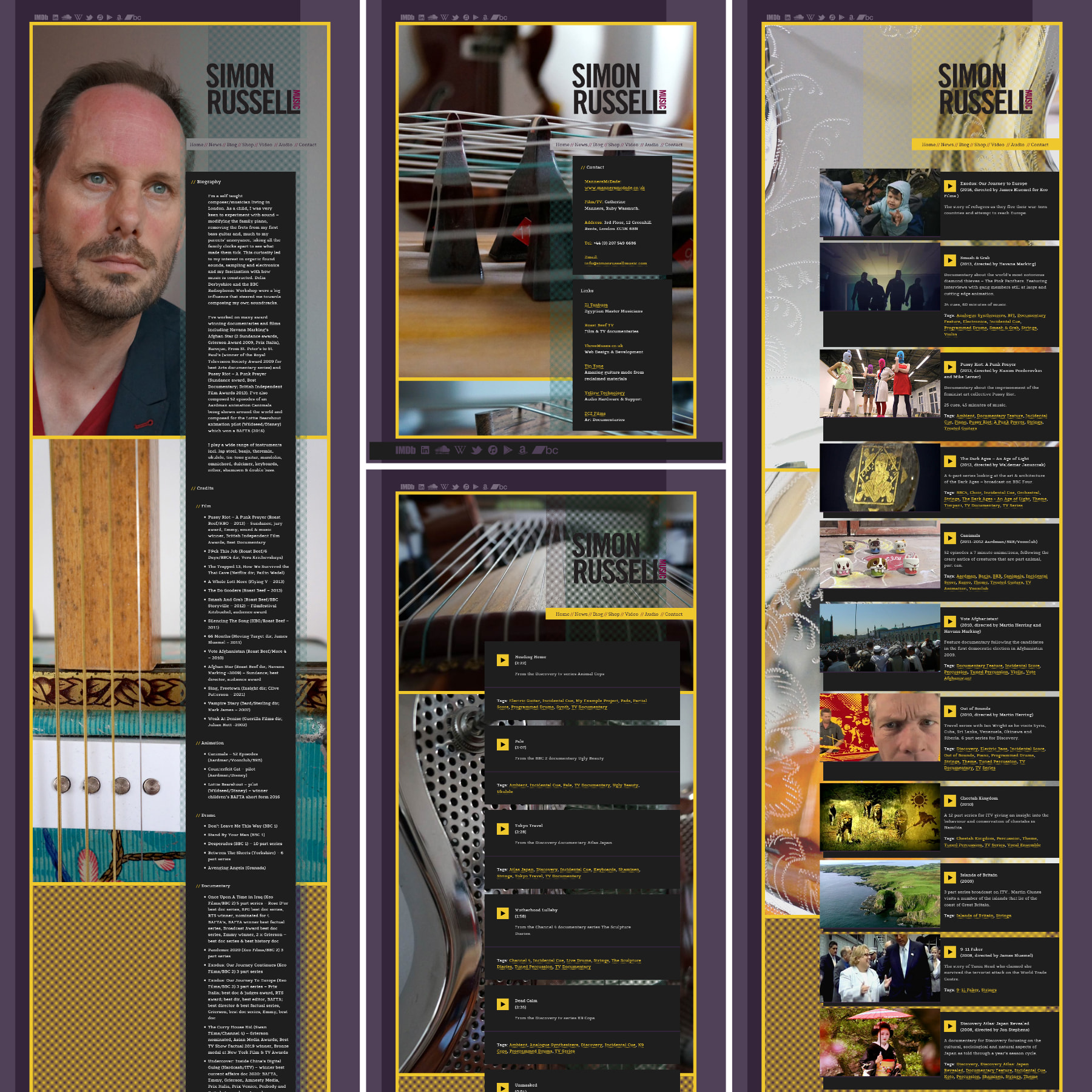
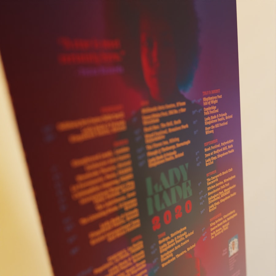
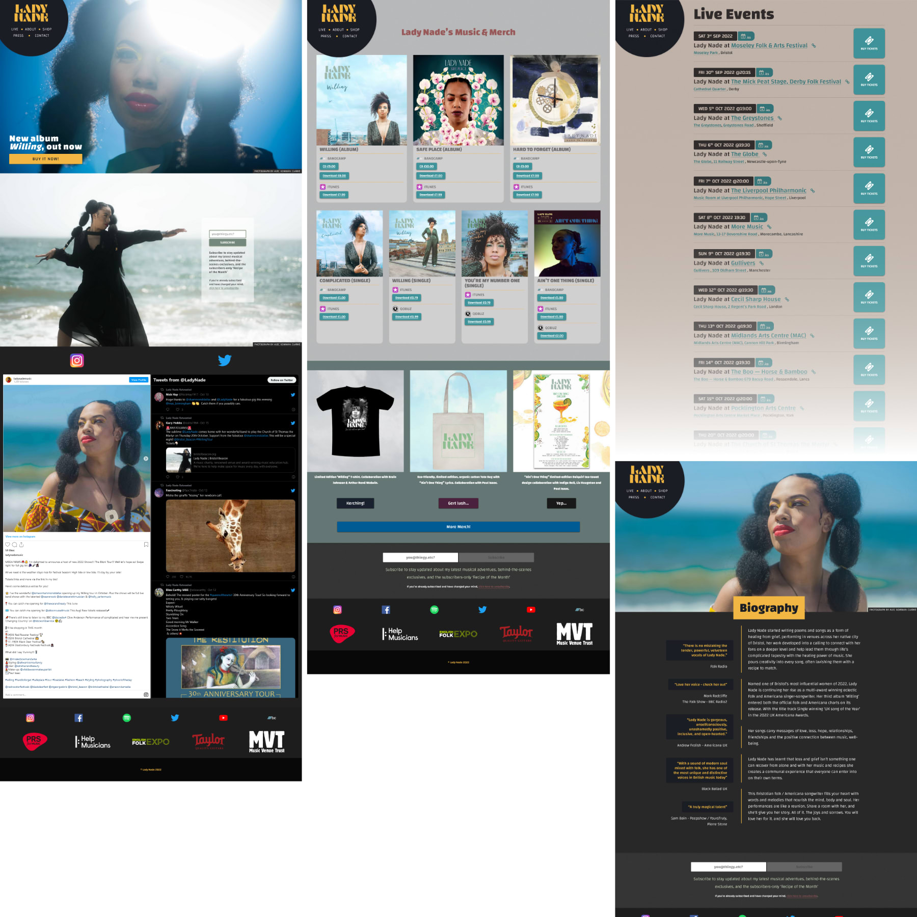
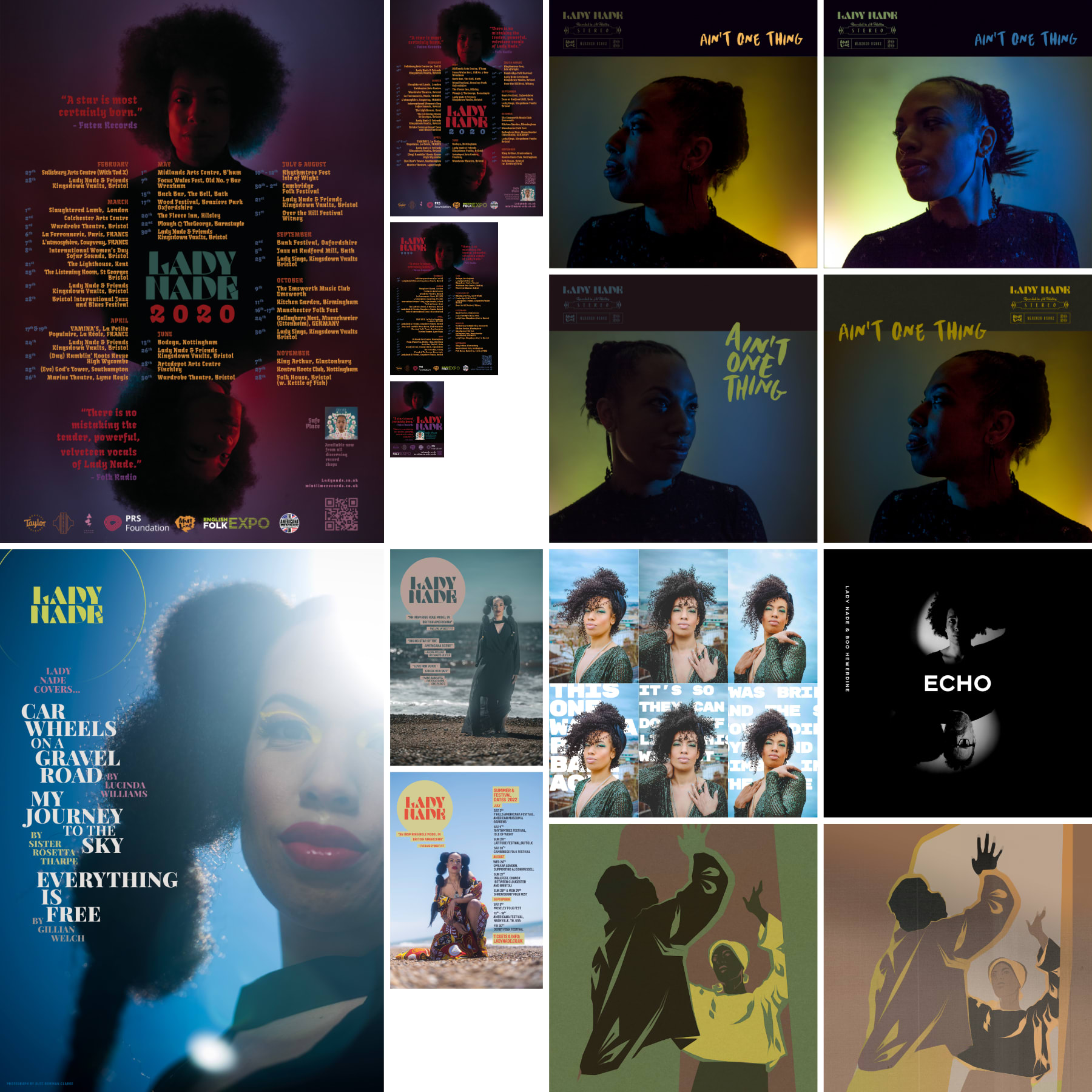
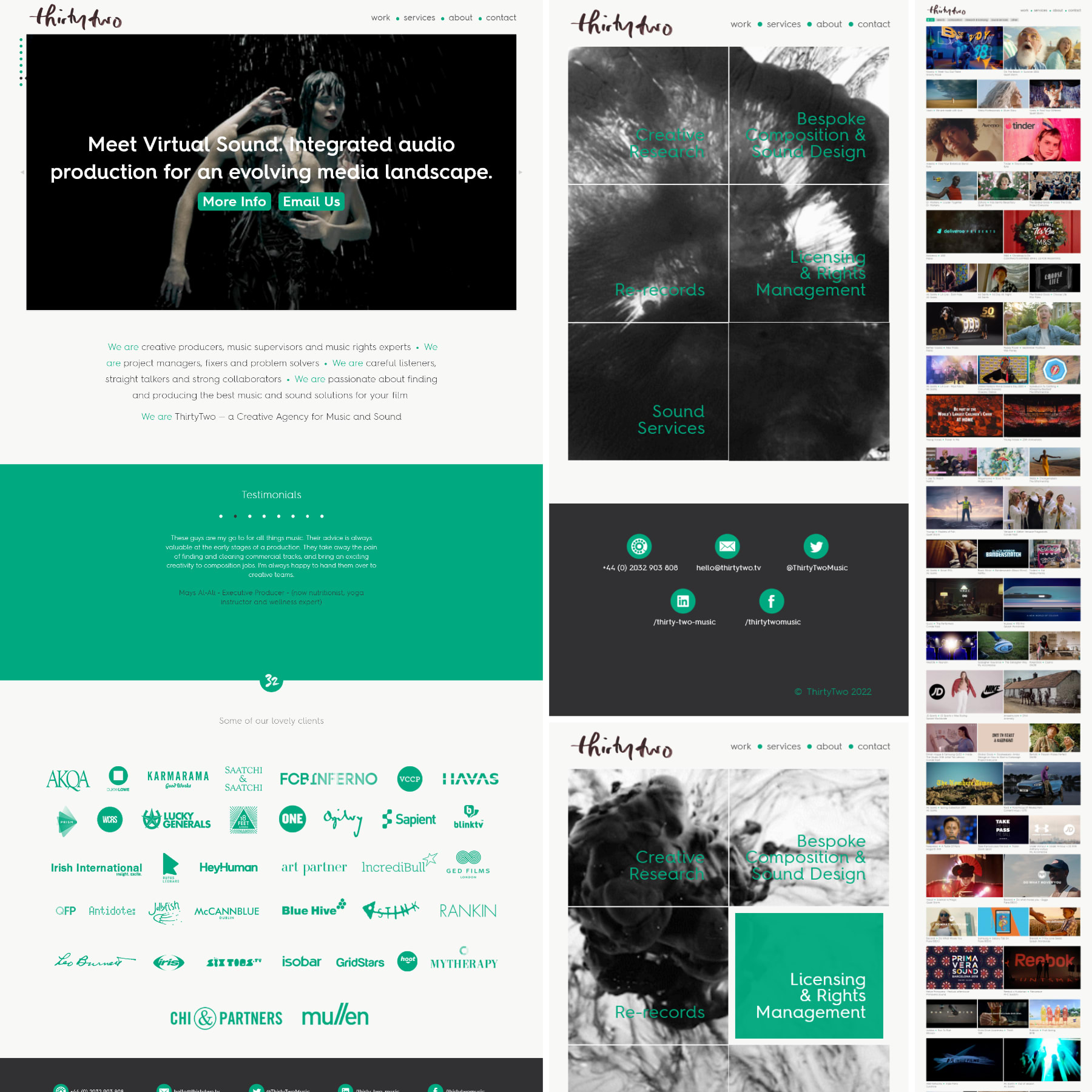
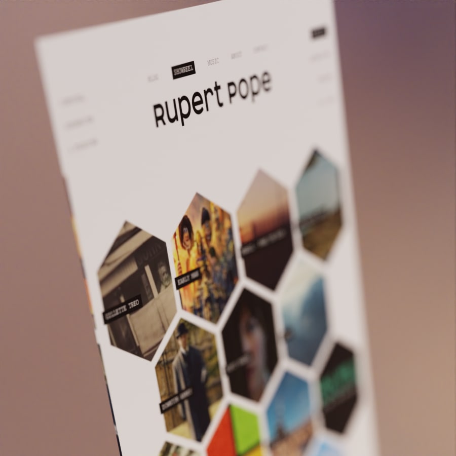
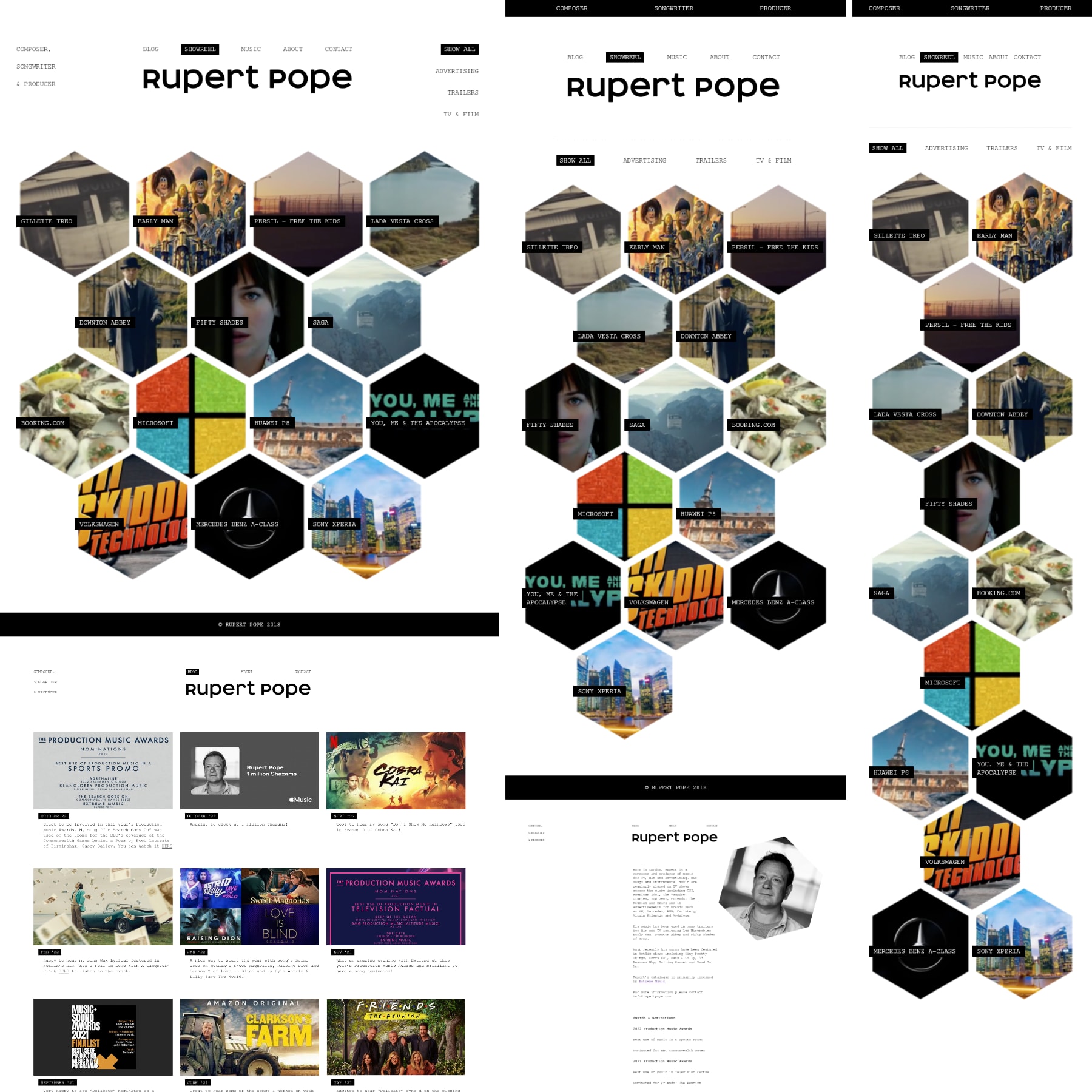
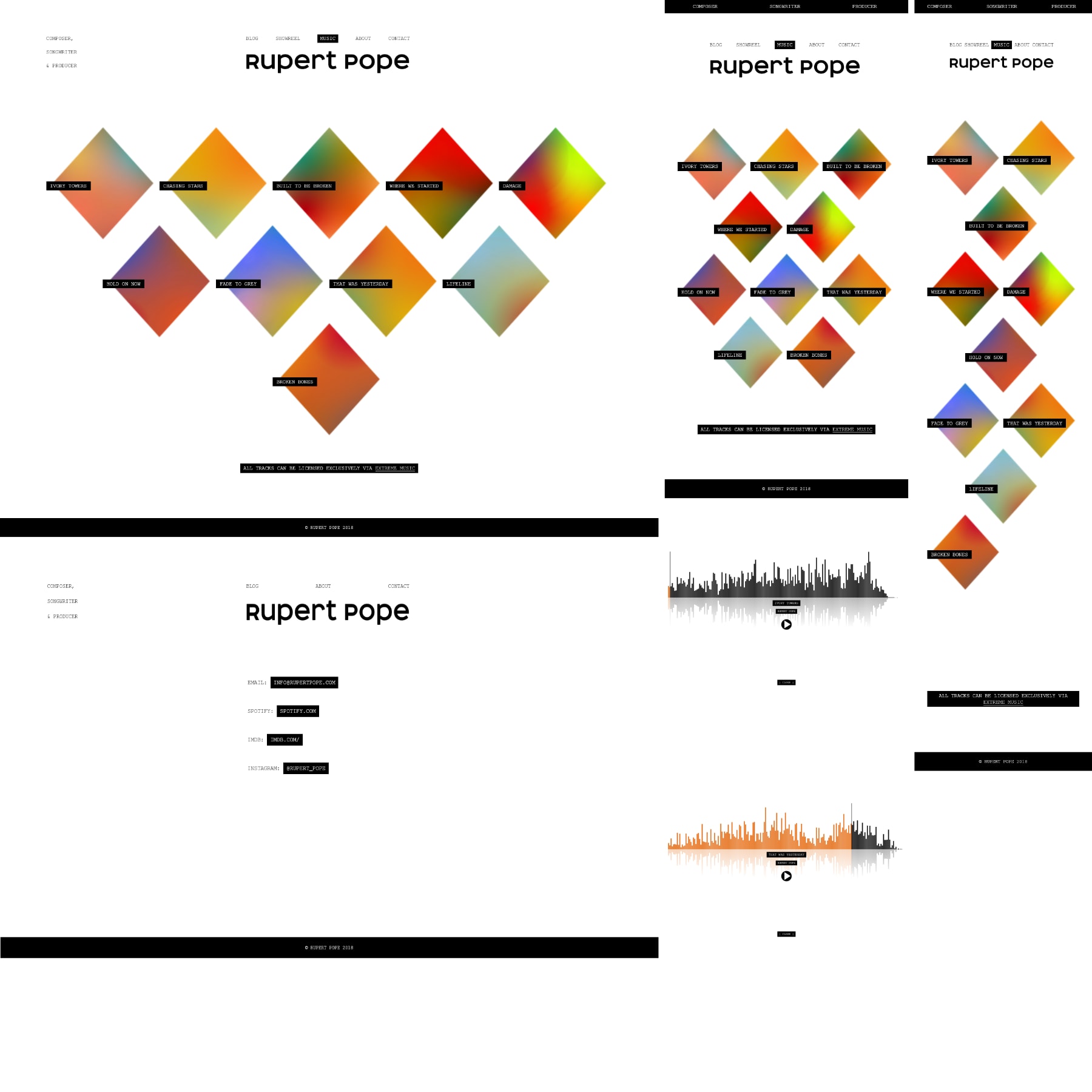
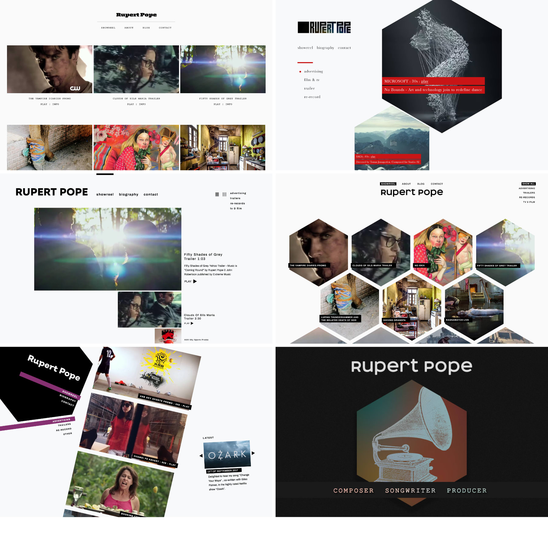
Bespoke WordPress Theme (2017-Present)

Plays heavily on Simon’s love of Photography. It also uses some interesting de-pixelisation of the poster images, and the use of moiré / interference patterns to work with (or against) the parallax scrolling. The site has aged in terms of the aesthetic, but has survived bit-rot surprisingly well.

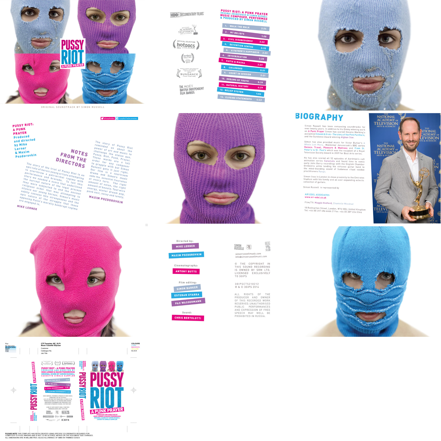
Digital Assets for an iTunes soundtrack release.

A limited run of pink-shell cassettes were also made.

Synopsis

Nade seems to be the rarest of clients - a touring musician and educator with an exemplary business mind and who pays aggressively on time.

I initially worked with Nade (having been recommended by Daniel Everett) in producing, mixing and mastering her 2019 album.

Having been drafted in as an emergency print-designer replacement, I’ve ended up replacing an ailing WordPress site with a (comparatively) high-performance static site (11ty/Nunjucks/FireBase), hosting for £0.24 / year with FireBase.

The new site had started out using SongKick’s API to populate love gig info, but their platform degraded into unreliability during the pandemic. The live event information is now manually updated: Plans are in place to phase in a CMS that edits/pushes markdown files to a GIT repository, which in turn triggers a build action, which then auto-deploys to FireBase. All behind Google Cloud Platform’s two-factor authentication. Probably.All I have to do now is build it.

ladynade.co.uk

The move from WordPress to a static site was fortuitously timed, as Nade (courtesy of a security-lax iPhone app) was hacked, and had to claw back her hard-won social media following. (Her Instagram account was lost in the process.) Since the app also logged into her (defunct) WordPress site, she’d have lost that too.

After a previously successful ad-hoc photo-shoot (testing some concepts) Nade booked another. On this occasion, between leaving Bristol and arriving in Winchester, it had become a socially-distant video shoot instead. With “black & white“ as the only concept and “strong light and shadow” as the one-string to my bow, we improvised successfully. So successfully, her co-star drafted in a pro videographer in friendly competition.

The footage was sent off for editing - where they thankfully fudged some of the DSLR’s not-so-crisp video quality with a few choice effects.

Various print / digital design jobs, photo isolations and a concept illustration.

The top row utilises my photography - test shots that ended up being used. Had the 2020 tour not been thoroughly cancelled, somebody may have even seen them.

Some early logo ideas using brushes, ink and no finesse whatsoever. The Lade Nade logos weren’t deemed legible enough.

Artist-approved shots from the concept / test shoot. Grading / processing, no retouching.

Note to self: It is quicker to re-plaster a dodgy bit of wall than to ‘fix it in post’ 24 times.

This Instagram post hellscape was result of telling the client we could batch-output a spreadsheet of gig dates into a set of layout templates.

The scary part being, I’m fairly sure she used all of them.

Synopsis

ThirtyTwo have always been a challenge. If presented with an infinite number of designs, they’ll always need to see one more, tweaked slightly. Unusually, for a business-to-business site, feedback tends to convey how they feel about certain things, not necessarily why or with any real indication of what’s right. Or wrong.

A delightful but baffling bunch, who’s kill-ratio currently stands at — Committee: 99, Designs: 1

Against all the odds, this is the third iteration of the site (and third rebrand) that I’ve managed to bleed from a stone. A fourth version has been in development for many months, and frankly anybody with a conscience would just let it die with dignity.

thirtytwo.tv

Screenshots of the current iteration. Subject to constant, fairly signifcant overhauls to functionality, managing the code-base for this one is tricky. It has also had to retain fallbacks to previous functionality for niche use cases.

An entirely bespoke WordPress theme that could have been optimised much further, were it not for the frequent necessity to rehash large chunks of it.

The Work page uses Dave Desandro’s wonderful Isotope JS library to filter categories.

Various designs / iterations from a previous incarnation of the brand.

Synopsis

Sister company of ThirtyTwo.tv - and equally formidable serial-killers-by-committee.

After introducing a brand manager, they were advised to jump ship from WordPress to Fabrik.io, to utilise a prefab theme. If the plan was to mitigate time and effort spent tweaking and re-tweaking, it was not immediately successful.

Fabrik.io do not offer a great deal of scope to customise a theme, so it was an up hill process to say the least.

virtualsound.co

The Testimonials carousel and interactive maps were not existing parts of the theme.

Ultimately, their favourite part of the site is the colour of the footer, which they chose.

A few VS monograms and logo motif ideas, selected from several hundred, none of which were quite right. Some of the motifs were stills taken from heavily processed 3D animation, created in Blender and subsequently distressed with post-processing.

For a brief period, “Product Bundles” were the burning agenda. I pitched the idea of using low-contast 3D rendered shapes to represent products and their bundles.

Since no concensus could ever be reached about which shape or material truly represented which product, the idea was left to die quietly.

Subsequently, similar ideas have been used in high-profile virtual-instrument libraries - so the concept was in the right place, at the right time, and in the right industry. Just the wrong client.

The two flow-charts were a rare, resounding success. Having been asked to dress-up a Google Slides presentation into a glossier PDF, the flowcharts were inexplicably repurposed as an animated GIF for e-mail marketing.

Synopsis

One of the most professional and courteous clients I‘ve ever worked with. By all accounts, there is absolute sheer chaos involved in recording, tour managing and wrangling wayward musicians from North Africa, India, and Tibet. And that’s just the visa applications.

The result is that if a brief can be nailed down, if an asset can be managed or catalogued, it has been done so with surgical precision.

Thanks to this approach 30IPS (aka Michael Whitewood) always get the most out of their budget, and leave enough time and space to welcome and explore ideas.

30ips.com

A minimal, lightweight static site. 30IPS running a tight ship allowed for some pleasing performance optimisations on the site: a quick LightHouse test has its performance at 100% and best practices at 92%. SEO and accessibility need revisiting (80%,76%) the former as Schema.org’s microdata format seems to have fallen from Google’s favour of late.

In a move from deep in left-field, Michael voiced his intentions to promote an artist, Nuba Nour, with a graphic novel. In a moment of hubris (and the proud owner of a shiny new Wacom Cintiq), I pitched for the job - unaware that illustration is nothing like riding a bike.

Implausibly, the project was green-lit, stories approved from Cairo, reference shots of the city and artists provided, and progress was made.

The Wacom Cintiq then abruptly died, and with bureaucracy and paperwork normally reserved for extraditing mummified remains, it was shipped off to Germany for several months of repairs.

By the time the Cintiq was repatriated, the project was stalled and Cairo was on fire. Note to self: Mission critical items come in pairs.

Various quick and cheap print/digital design jobs.

Synopsis

This is the fourth iteration of Rupert’s website that I’ve made, with a fifth in negotiation.

rupertpope.com

The original homepage of the site, it was subsequently shelved after it performed poorly in subsequent iOS updates.

The shape-changing on category filter can be seen on a development version still online here.

An over-ambitious idea for the time, it’s not fared well.

Audio-only showreel section of the site.

Some of the earlier stage designs for the site, and the site’s fallback OpenGraph image.

Synopsis

Mindful Workshop was a startup with a loose, rapidly evolving brief. Different marketing strategies were brought onboard and large functional changes frequent - using a bespoke theme to provide this became limiting. Using the bespoke theme as a jumping off point, the site was taken under the wing of the marketing guru, with Divi and fistfuls of plugins drafted in. A quick LightHouse test shows a serious hit across all scores as a result.

Screenshots of the vesrions of the site I worked on. Most of the character and charm of the design were being incrementally removed, as the marketing recommendations recieved were to make it appear “more generic”.

The hunt for the gridiest grid, and some “I can’t belive they’re not stock” photos of nature I provided.

Some first-draft logo designs (top-right was chosen, not mine). Some initial homepage designs, before a series of photoshoots had been completed to populate the pages.

Synopsis

I’ve worked with Dan musically for a number of years. This website had started life as a bespoke “academic” WordPress theme - to allow for his writing to be transcribed for the web, retaining the necessary referencing and footnotes etc.

Ultimately, the site’s purpose changed, and the latest iteration draws from the design of his most recent album.

danieleverett.co.uk/

Screenshots are from an offline development version - converting the WordPress theme to 11ty & Nunjucks templates.

The concept for the album cover collage was brainchild of masterful photographer Jethro Massey, who&tsquo;s keen eye made the mosaic process surprisingly painless.

Top-right is a 3D render of the album digipak and onbody, with alternative onbody designs shown bottom-right.

Synopsis

Another ageing site - this one is a bespoke wordpress theme from 2014.

Roughly every six months there are plans to redesign it - but either workload or cashflow get in the way.

Since the site was updates so infrequently that the client couldn’t remember how to do it, the site quickly cloned from WordPress to a static site, and hosted on FireBase, essentially for free.

billieachilleos.co.uk/

The site was heavily influenced by Pinterest, and uses David Dessandro’s wonderful Masonry JavaScript library for the image layouts.

When Billie’s usual CAD gopher was unavailable, I was drafted in to provide CNC-friendly vector graphics detailing placements of cuts and photo-etching.

In addition to being a fallback for CAD related digitising, I’ve also been to provide rough, proof-of-concept 3D visuals on a few of projects using Blender. I’m definitely not allowed to tell you about one of the jobs, so I’ll stop there!

Synopsis

A purely technical role. I could, and should have, written about this at length.

Synopsis

A wedding invite commissioned by a stand-up comedian and his fiancé. The PDF here to supplement the slightly blurry 3D renders. PDF.